
Aug 2024 - Dec 2024
LivingProof

01 Project Scope
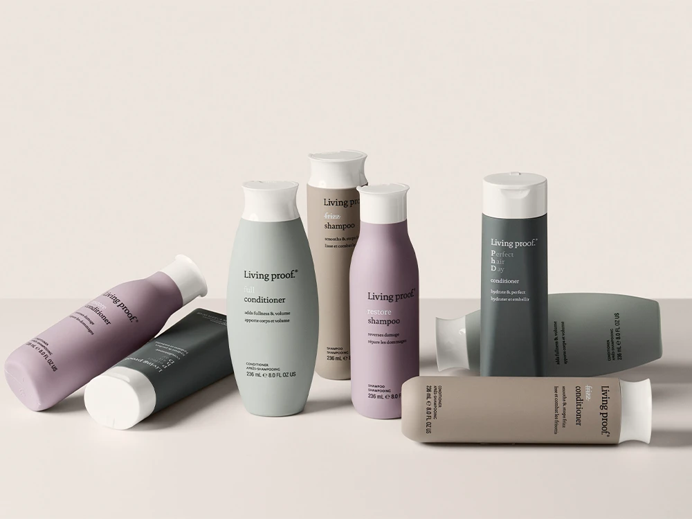
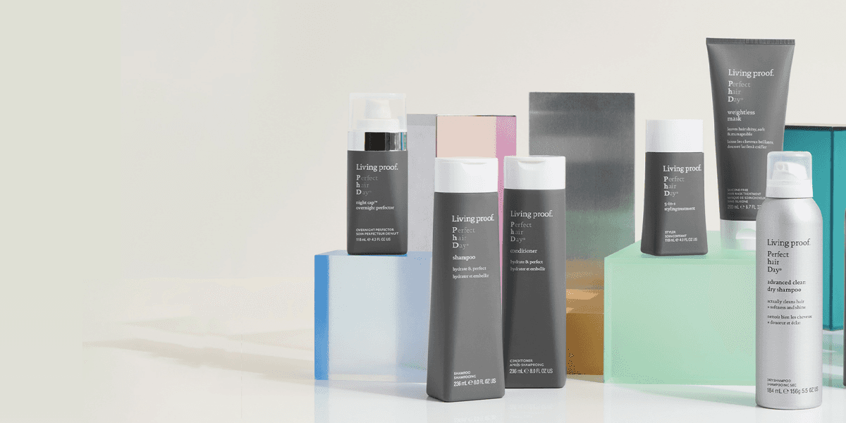
About LivingProof
Living Proof (LP) is a science-backed haircare brand founded in 2005 in Cambridge, Massachusetts, known for its science-driven formulas developed with scientists and hairstylists to address common hair challenges.
Context
In August 2024, as part of my Experience Studio class at Purdue University, I worked on a project with Living Proof to evaluate the user experience of new users during their discovery and checkout processes.
User Group
Our target user group was women from the ages 20-30 and first-time users
Strategy Team at LivingProof,
First-time Customers

02 Empathize
New User Brand Perception
How might we understand & enhance new users’ perception of LP’s brand and the current LP website experience?
Desk Research
To assess LivingProof's brand perception, I analyzed Amazon reviews, Reddit discussions, LivingProof's own reviews, blog posts, and Instagram content. My findings were…

After conversing with the LivingProof team I found their brand messaging goals were
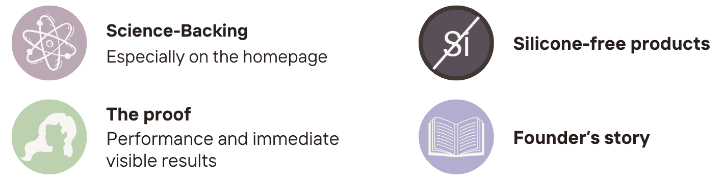
Based on my findings and their goals, I identified areas for improvement in all aspects of their messaging: clarifying the science behind their products, emphasizing that their products are silicone-free, highlighting visible results, and sharing their founders' story.
Comparative Analysis
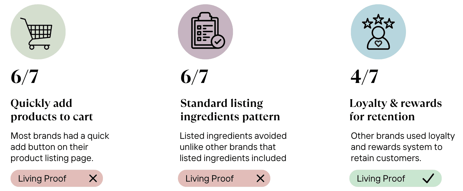
When conducting the comparative analysis, my team and I wanted to identify trends and find opportunities to better align with evolving user needs and industry. When looking at competitors, we investigated the retention strategies, purchase patterns, product discovery, ingredients, reviews, customer support, and checkout process for each competitor.
I focused on Living Proof's competitors, Olaplex and Odele. Along with my team's findings, we discovered the following.
Talk Aloud Walkthrough
For the talk-aloud walkthrough, I aimed to understand new customers' impressions of the current Living Proof website. Using open-ended prompts, participants explored the site while verbalizing their thoughts. Based on my findings, combined with my team's, we identified the following insights.

Understanding Living Proof’s New User Experience
How might we understand and improve how new customers discover the right products and make informed purchase decisions?
Heuristic Analysis
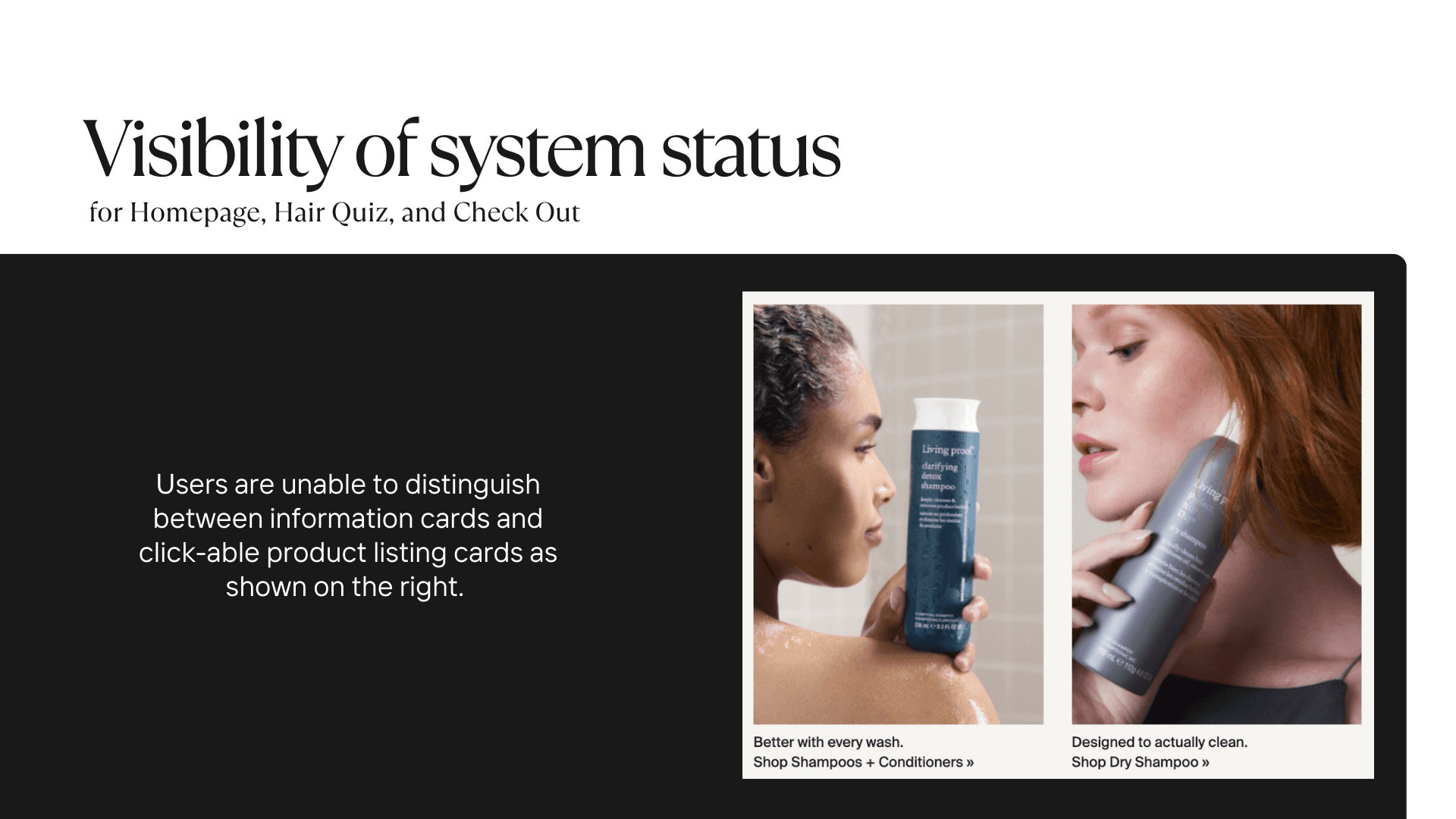
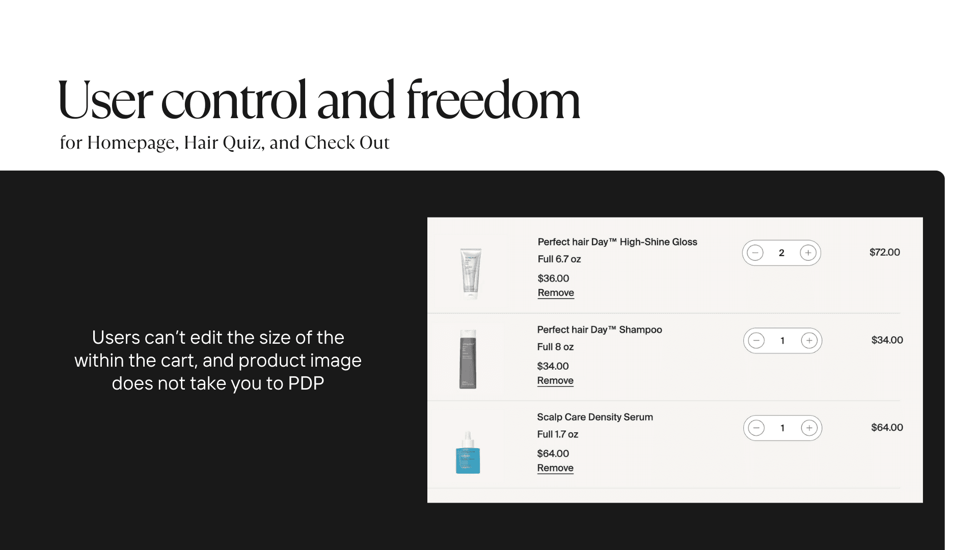
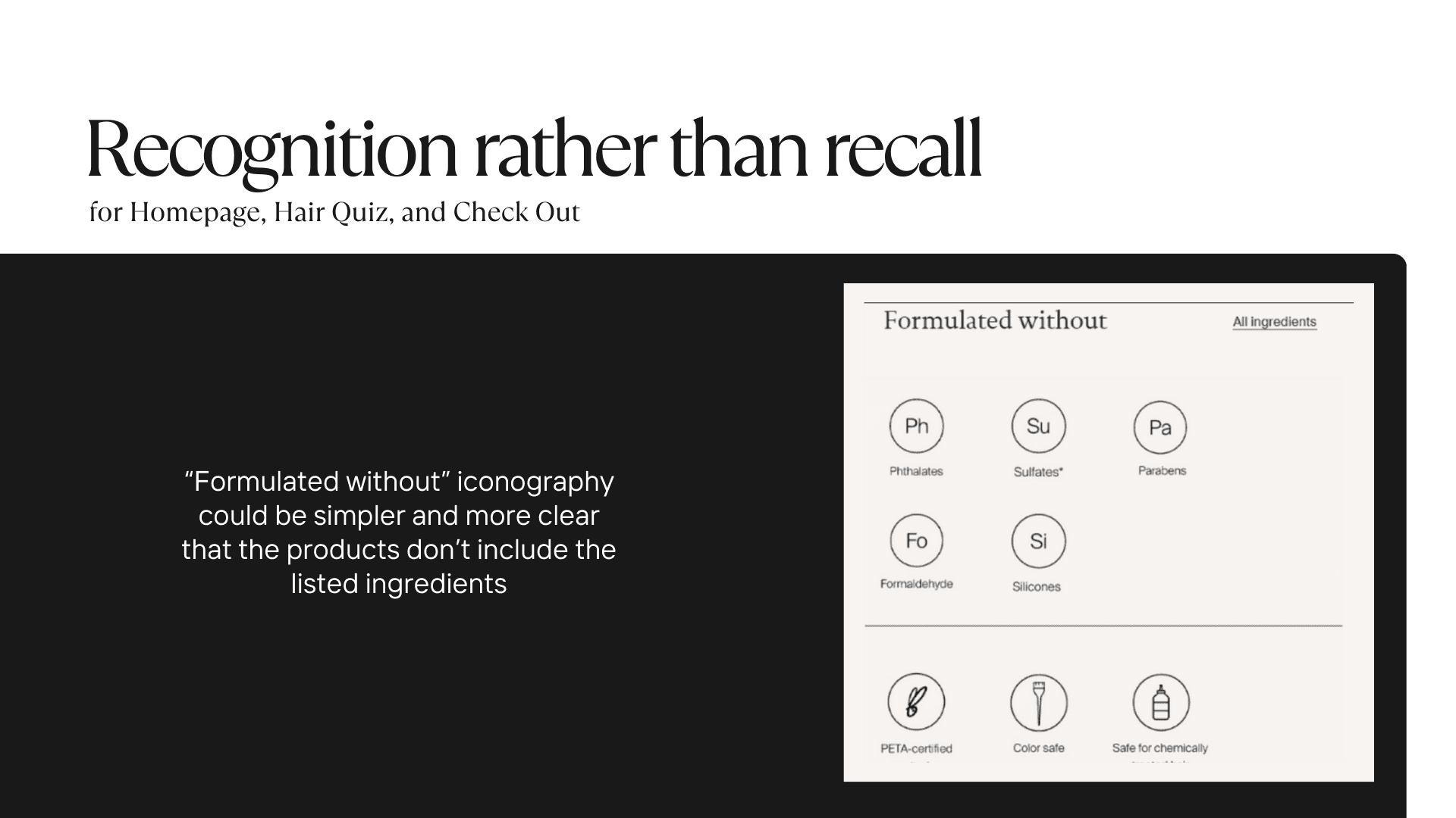
To usable and intuitive is the website from a UX perspective, my team and I conducted a heuristic analysis on the home page, product listing page (PLP), product description page (PDP), Hair Quiz, and Check out. Across all pages I found that the major violations were on for Visibility of system status, User control and freedom, and Recognition rather than recall.
Usability Evaluation
In my usability evaluation, I assessed the discoverability of product features, users' ability to find purchase incentives and the right products, and the methods they used to select suitable hair products. Based on my findings, combined with my team's, we identified the following insights.

WHY DESKTOP?
Mobile vs Desktop

Desktop Heuristic
Based on our new findings, I conducted another heuristic analysis for the desktop version and found results similar to the mobile analysis.
"I prefer browsing on my laptop so I can have multiple tabs, and research quicker"

03 Data Analysis
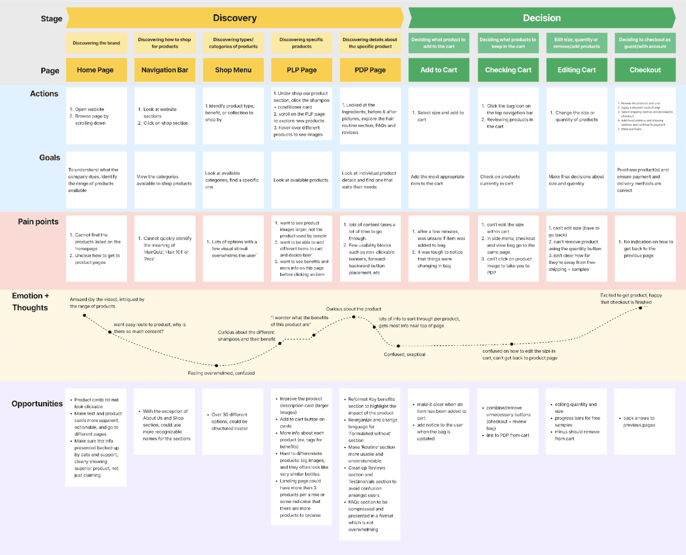
Journey Mapping
Organize Findings
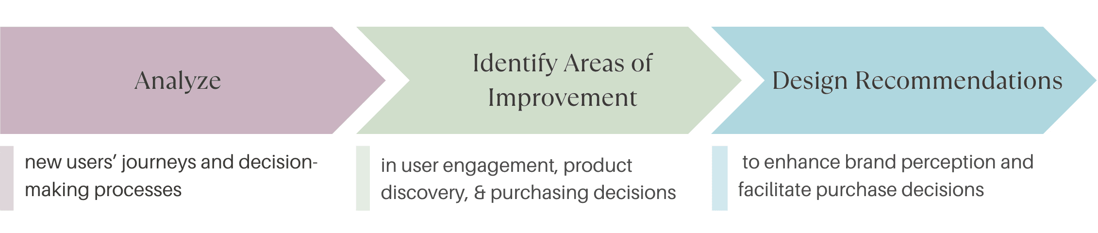
How can we synthesize and organize our data into one deliverable?
Journey Map
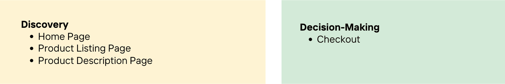
Using the data that my team and I gathered, we created a journey map to synthesize our data and identify areas to visualize our recommendations. To create the visualizations we decided to focus on stages with the most impact on purchase conversion and brand interaction. Thus we identified the following areas to visualize our recommendations:
04 Design
Prototyping
Visualize Recommendations
How can we organize data into a deliverable that visualizes opportunities to address deficiencies?
Protoyping
After identifying the areas to visualize above, my team and I created visualizations for each of them. I focused on visualizing recommendations for the checkout process.
Checkout Original LP Design
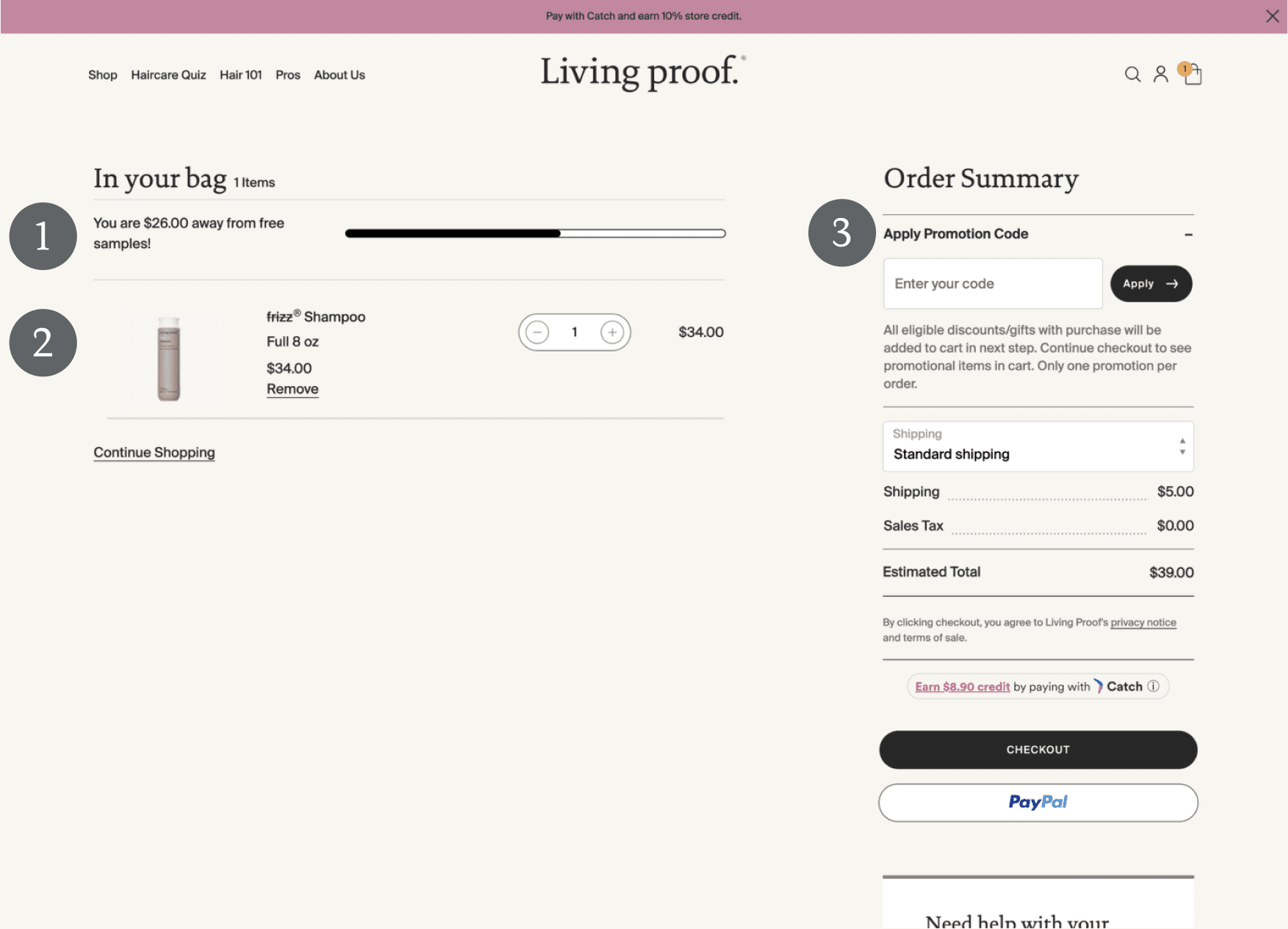

During testing, I found that many users experienced banner blindness to the free sample bar. Additionally, the total amount required to qualify for free samples was unclear.

In addition, I discovered that users were unable to view the product description for any item in their cart.

Through heuristic evaluation and user testing, I found that the order summary was wordy and could create high cognitive load for users. Additionally, there were non-functional buttons that offered no usability, such as the standard shipping button.
Checkout Redesign
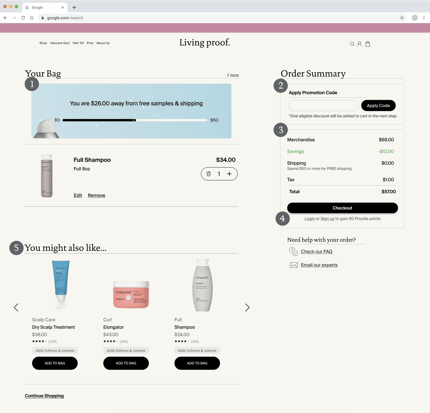
This section clarifies the total amount required to qualify for free samples and indicates the dollar amount needed to reach that target. To draw more attention to the banner, it could feature a small animation of hairspray spraying across the progress bar as it loads.
The promotion code area has been condensed down to text to reduce cognitive load for the user, and increase readability.
The billing receipt highlights any savings from store-wide discounts and applied promo codes. Additionally, the shipping section clarifies how much the user needs to spend to qualify for free shipping, and removes the unnecessary button.

Below the checkout button, there is a promotion encouraging users to log in or sign up for Proofie Points to increase customer retention.
Finally, I included a cross-selling carousel to increase cart value, and help customers discover useful products they might have overlooked.

05 Outcomes
Live Updates
Throughout the project, our team communicated our progress and recommendations with the Living Proof team, and we noticed that the Living Proof website underwent multiple updates during the semester, some of which aligned with our recommendations.
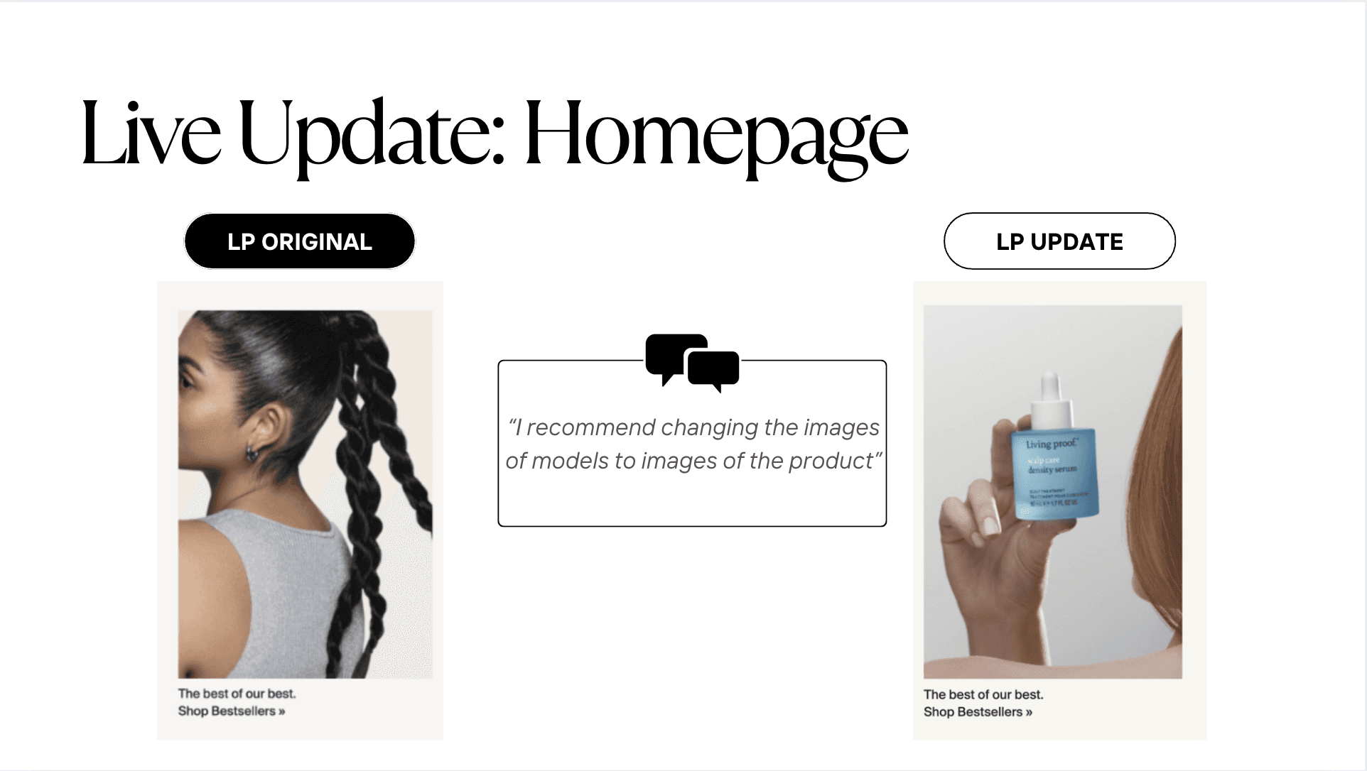
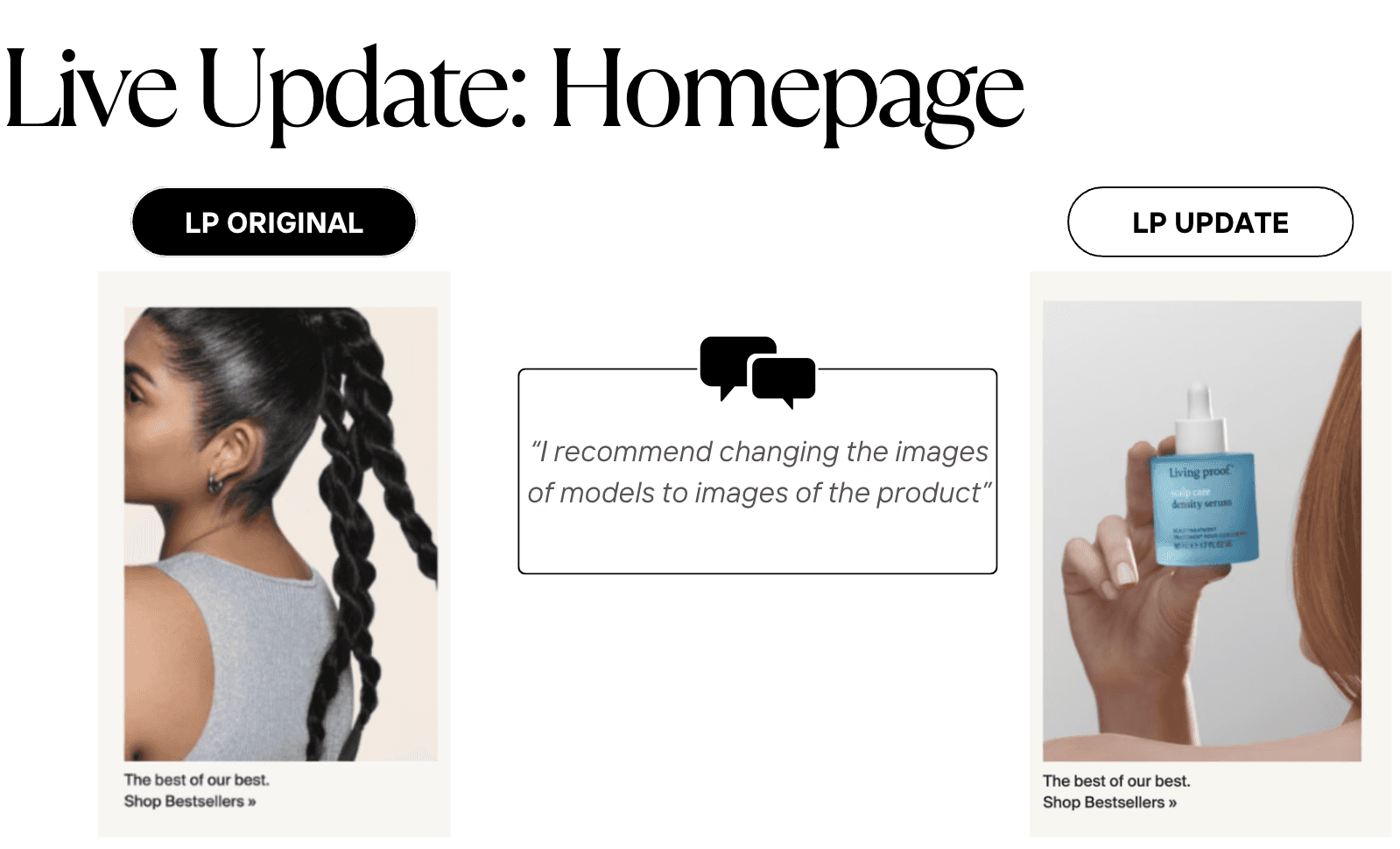
Homepage
After conducting a heuristic analysis on the homepage, I recommended to change the images on product listing cards to images of the product instead of the model.
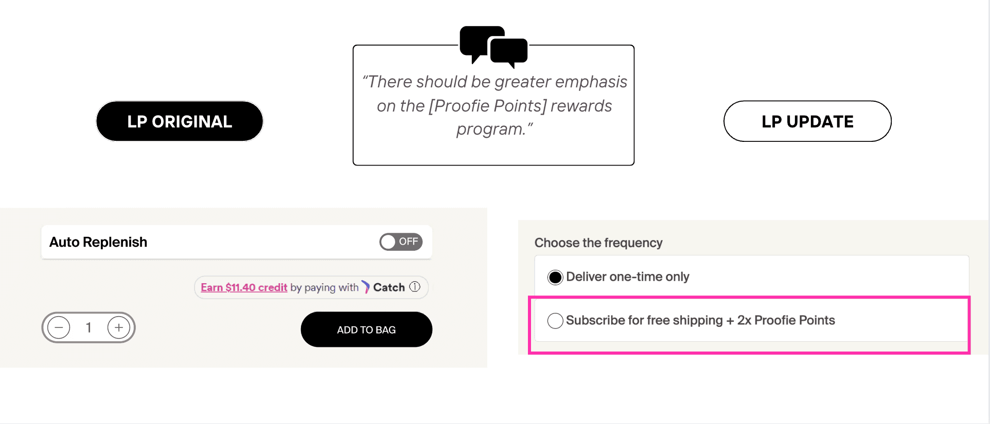
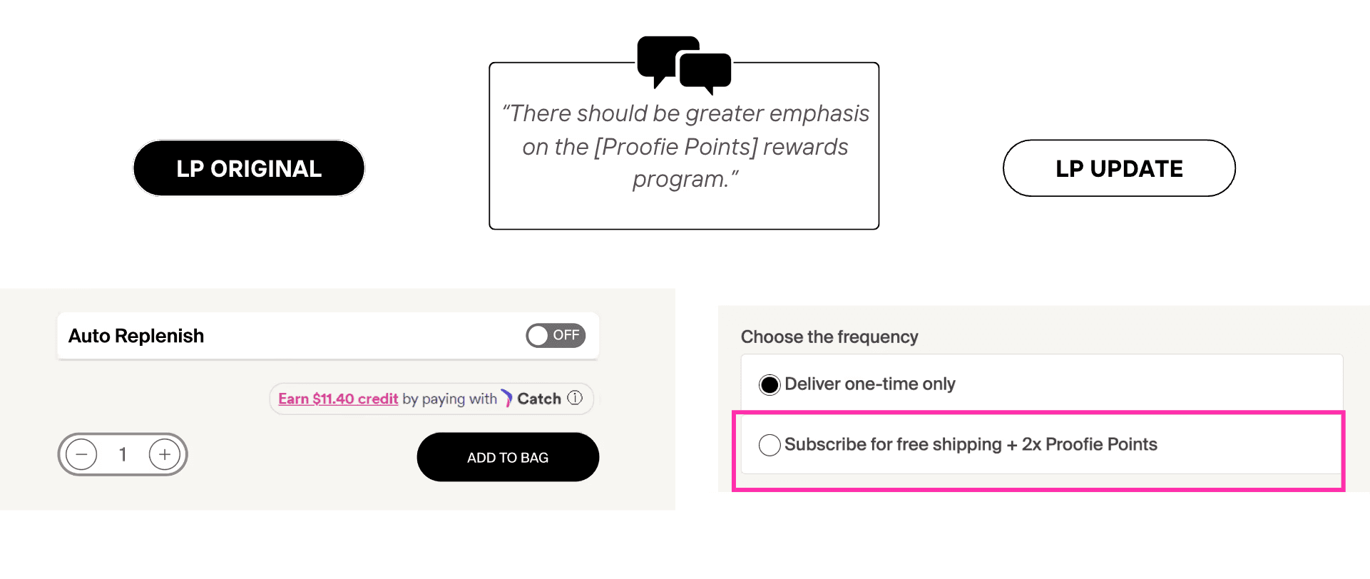
Product Description Page
While presenting my design recommendations for the checkout page, I suggested integrating promotions for the Proofie point system on the checkout page and other areas of the site. As a result, they added a Proofie points promotion to their product listing page.
06 Reflection
Coming into this project, I was interested in learning more about how UX impacts customer retention and how to conduct various research methods. Throughout this project, I was able to explore both of these and more. I learned how to professionally communicate with clients by taking on the role of communication lead. I also discovered the importance of understanding business goals and resources to tailor design recommendations effectively. While learning different research methods, I also gained experience in creating protocols and conducting user testing. Overall, this project has helped me learn a lot more about research techniques, collaboration, and how to clearly communicate and articulate my thoughts.